Calibration Plot for Propensity Scores
plot_calib.RdCreates a calibration plot to assess the local calibration of estimated propensity scores.
Usage
plot_calib(
  object = NULL,
  ps = NULL,
  Tr = NULL,
  breaks = 10,
  theme.size = 15,
  ref.color = "red",
  ...
)
Arguments
- object
An optional object of class `lbc_net`.
- ps
A numeric vector of propensity scores. Required if `object` is not provided.
- Tr
A binary numeric vector indicating treatment assignment (1 for treatment, 0 for control). Required if `object` is not provided.
- breaks
Integer specifying the number of bins to divide the propensity scores into. Default is 10.
- theme.size
Numeric specifying the base font size for the theme. Default is `15`.
- ref.color
Character specifying the color of the reference line. Default is "red".
- ...
Additional arguments passed to `ggplot2` layers for customization.
Details
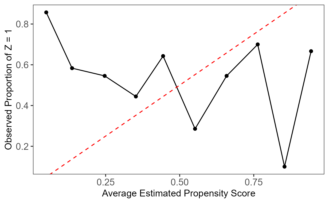
This plot assesses the local calibration of model-based propensity score estimation methods. The estimated propensity scores are divided into `breaks` equal-length intervals, and the average propensity scores and treatment proportions are calculated for each subgroup and plotted. The dashed red line represents the 45-degree reference line, indicating perfect calibration.
A well-calibrated model should align closely with this line, ensuring that the estimated propensity scores match the observed treatment proportions within each bin. Deviations suggest poor calibration.
Examples
# Example with manually provided propensity scores and treatment indicators
set.seed(123)
ps <- runif(100)  # Simulated propensity scores
Tr <- sample(0:1, 100, replace = TRUE)  # Random treatment assignment
plot_calib(ps = ps, Tr = Tr, breaks = 10)


if (FALSE) { # \dontrun{
# Example with an `lbc_net` object
model <- lbc_net(data = data, formula = Tr ~ X1 + X2 + X3 + X4)
plot_calib(model)
} # }
if (FALSE) { # \dontrun{
# Example with an `lbc_net` object
model <- lbc_net(data = data, formula = Tr ~ X1 + X2 + X3 + X4)
plot_calib(model)
} # }